A RETURN TO THE ORIGINS WITH MODERNITY IN VIEW
Licor Beirão presents its new bottle and shows that irreverence and innovation are truly one of the great constants of its almost century-old journey. Renewing the look of one of the icons of Portuguese identity is only natural: this is the eighth time that Licor Beirão has modernized its bottle since 1929.
The brand refuses to get too comfortable and modernizes its shape, adapting it to a more sustainable and ecological solution. The brown glass is a return to the brand's origins and is due to the use of a greater variety of recycled materials and the fact that it is a narrower bottle also allows for optimization in its transportation.
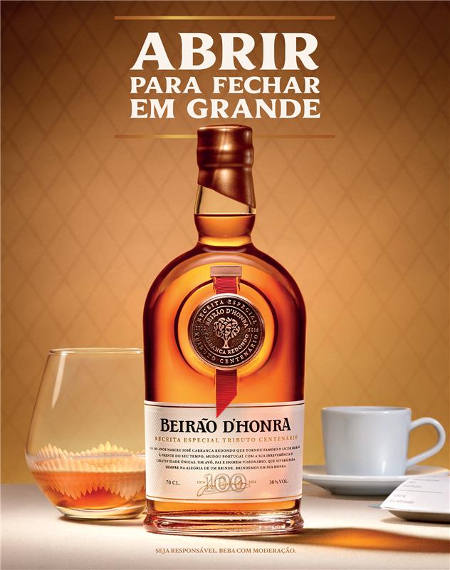
The color scheme that the brand has used since the 60s, yellow and red, is reinforced, as is the slogan "The Liqueur of Portugal” created and launched by José Redondo, son of the brand's founder and who is still responsible for the production and for maintaining the quality of this liquid intact, because even so, the best thing about the new bottle is having Beirão! Not to mention that, in an era of Artificial Intelligence, each bottle of Beirão continues to have a human touch through the careful placement of the ribbon, values of the brand and the family that do not fade over the years. The new look marks a new era in which the relevance of the number 1 spirit in Portugal is reinforced, with fans of all ages and with the aim of taking Portugal to the four corners of the world. A true example of a brand that is becoming younger as the years go by.
THE VARIOUS ELEMENTS:
The Ribbon:
An element that has been on the bottle since the 1930s and that reflects an essential value of the brand and the family – the human touch.
This ribbon that decorates the bottle of Licor Beirão is placed manually, ensuring that each of the millions of bottles of Licor Beirão spread around the world has had at least one human touch!
Embossed Elements:
The signature of José Redondo, son of the founder José Carranca Redondo and responsible for production, is now drawn and embossed on the bottle itself, a symbol of quality assurance and commitment to honour.
Coat of Arms of Lousã:
From the town of Lousã to the world, Beirão has never hidden its pride in its origins.
The Seal:
Gains new prominence and proudly reinforces the slogan "The Liquor of Portugal";
The tree of hearts symbolises the family tree, which represents continuity in a company based on the pillars of the family.
Shape:
The new bottle model is narrower and more elegant;
This shape allows for optimisation of transport and consequently reduces environmental impact.
Glass:
The brown glass is a return to the brand's heritage and the result of using a greater variety of recycled materials compared to the previous bottle.
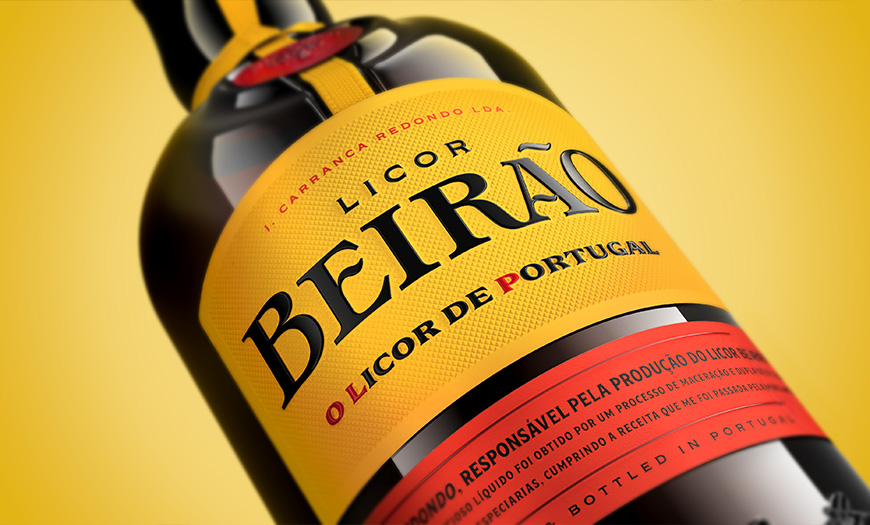
Label and Back Label:
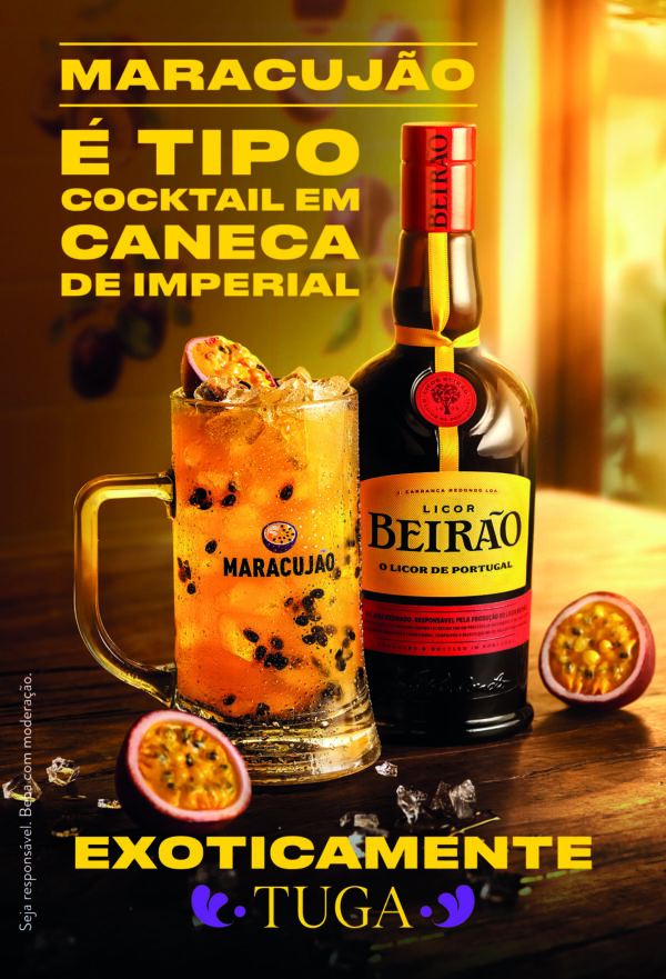
The label's background is yellow, reinforcing the brand's most recognizable color since the 1960s.
The back label now includes the perfect serve and a QR code for more information.
Find out more here:
Imagens de Marca
Revista de Vinhos
Green Savers
Grande Consumo
Eco Sapo